sticker saga
a scrapbook that got so full it popped into the third dimension. kraft paper, washi tape, die-cut stickers and a marker that never quite draws straight.
free on every plan
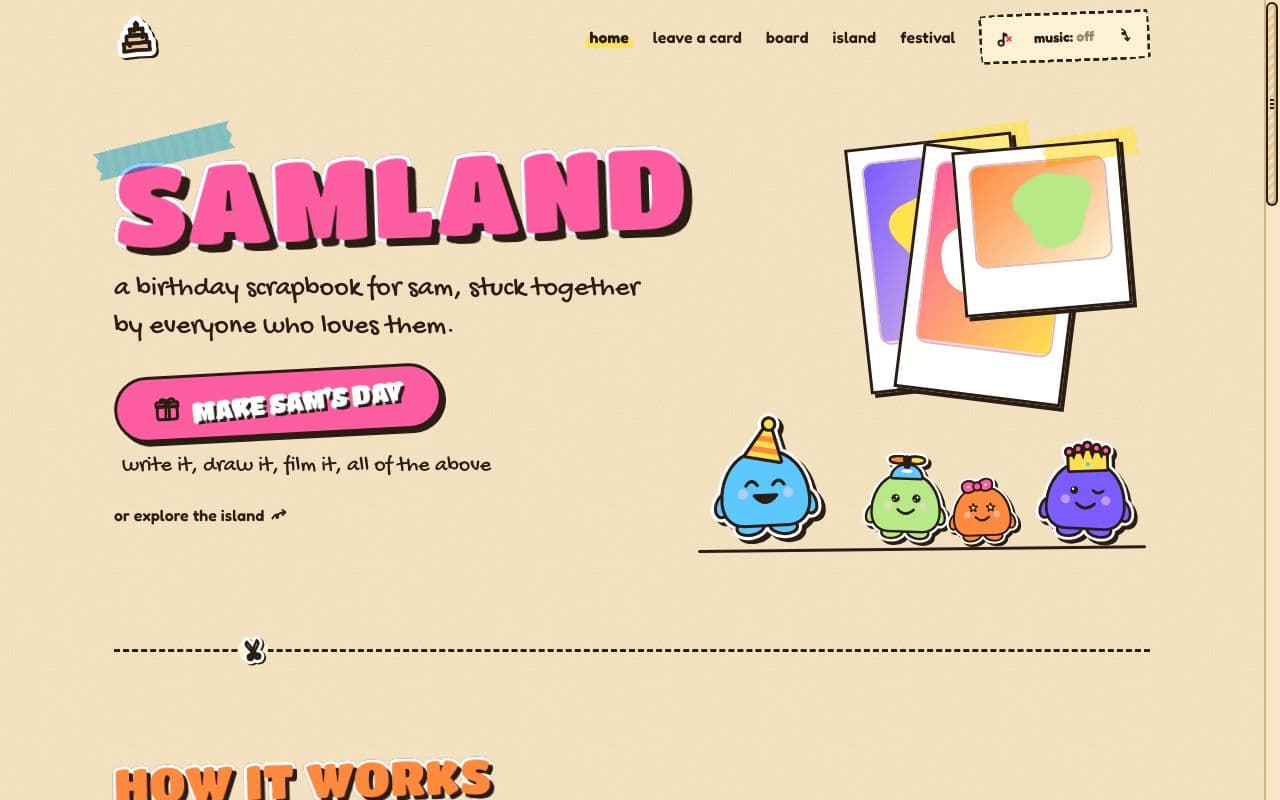
the look, in parts.
everything sticker saga changes, piece by piece.
the paint chips
- butter paperthe page
- kraftcard stock
- bubblegumbuttons and name tabs
- tangerinehats and hover
- lemon highlightertape and swipes
- sky stickerthe sea and focus
- lime smudgegrass and success
- grape sodathe love meter
the type
- headlines
- Titan One
- handwriting
- Gochi Hand
- everything else
- Fredoka
accent colours it comes with
- bubblegum
- tangerine
- lemon
- sky
- lime
- lavender
best for
- any birthday
- kids and grown-ups
- a first site
the nav · marker links
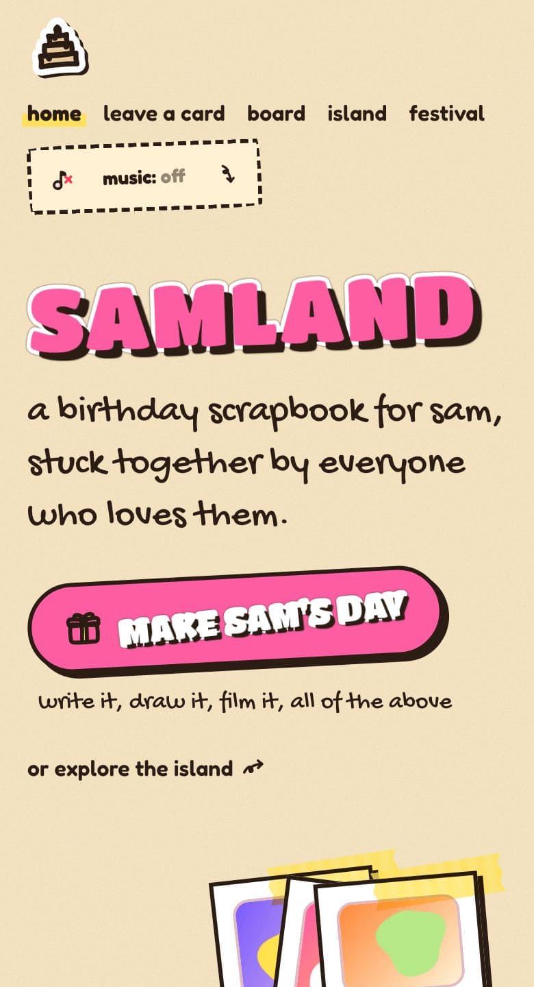
lowercase links with a lemon highlighter swipe under the page you're on, and a dashed music ticket. on phones, the same links, wrapped under the cake sticker. the pages are called home · leave a card · board · island · festival.
the scrollbar
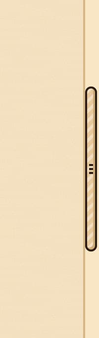
on every page.
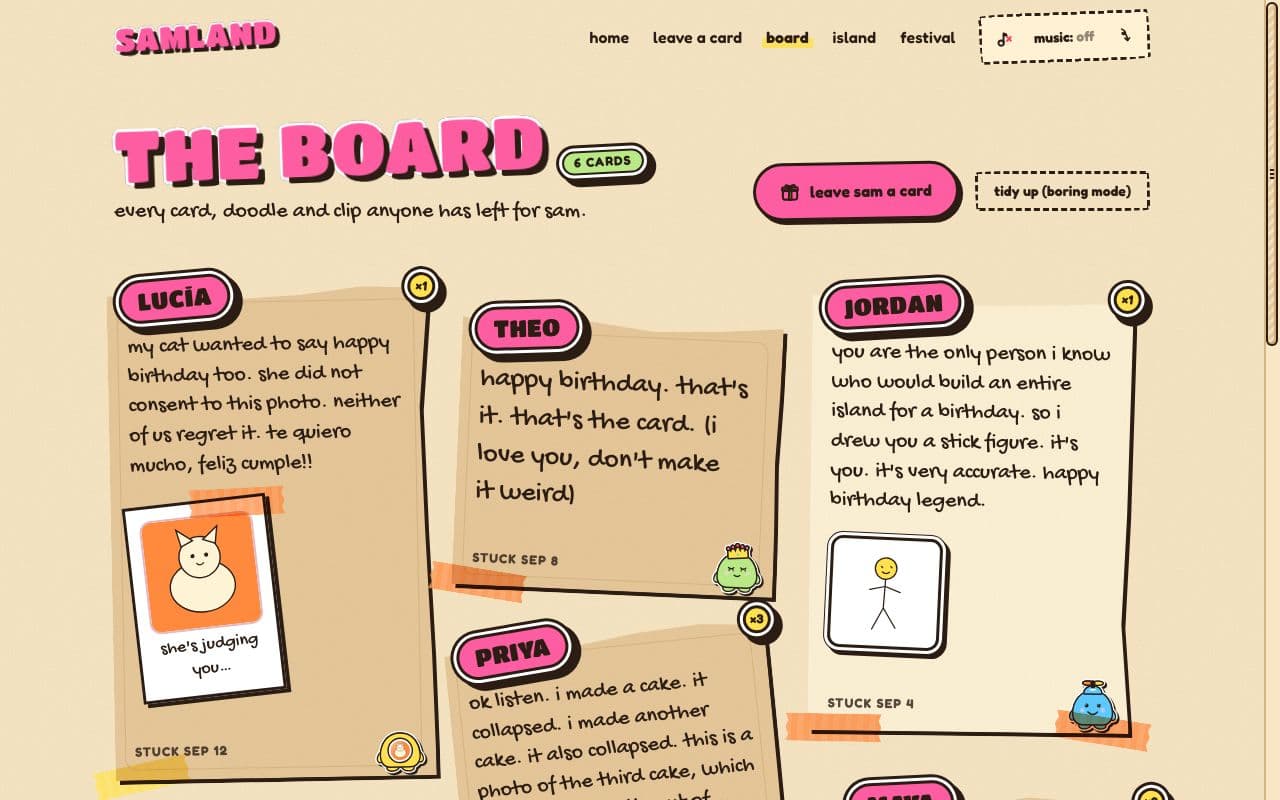
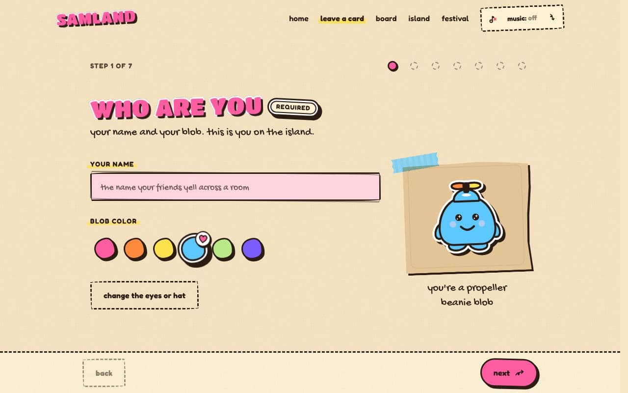
the board and the card maker, as friends see them.
the idea
Sticker Saga looks like a friend made it at 2am with a glue stick, a roll of washi tape and a fat marker. every surface is paper: butter-coloured pages, kraft card stock, eraser-pink boxes to write in. nothing sits perfectly level. cards tilt a degree or two, as if they were pressed down in a hurry, and straighten up when you hover over them, like you just smoothed them flat with your thumb.
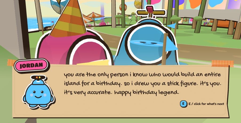
the whole look runs on one rule we call the sticker rule: a white die-cut rim, a dark ink outline and a hard, offset shadow. headlines are stickers. buttons are stickers. the name tabs on friends' cards are stickers. and on the island, every blob, every tree and the giant cake carry the same white rim and ink line, so a card on the board and a character on the island read as the same object made of the same stuff.
the palette
the colours are named like the stationery they came from: bubblegum pink for the big buttons and the birthday person's own blob, tangerine for party hats and frosting drips, lemon highlighter for tape and the sun, sky sticker blue for the sea and focus rings, lime smudge for the island's grass, and grape soda for the love meter and the confetti. all of it sits on butter paper and kraft, with marker ink for every word.
text is always dark ink on a light paper, or white on a strong fill, so it reads easily at every size, including on a small phone in bright sunlight. the bright colours are for fills, stickers and decoration, never for long runs of small text. the host can swap the main colour for one of six checked accents (bubblegum, tangerine, lemon, sky, lime or lavender), and every big button and name tab follows it.
the type
- Titan One for the headlines: round, heavy and loud, cut out like a vinyl sticker.
- Gochi Hand for the handwriting: captions, card messages and the little notes in the margins.
- Fredoka for everything you read at length: soft, friendly and very legible.
the birthday person's name gets the full treatment on the front page: a huge sticker headline, a strip of tape across one corner and a little wobble when it lands. friends' names sit on bubblegum tabs at the top of their cards.
where you'll see it
it's not a skin on one page. the theme reaches every part of the site: the countdown on the front page, the card maker friends use (with a paper drawing canvas and marker swatches), the board where every card is taped down at its own angle, the island, and the festival booths. the dialogue box a friend speaks through on the island is a paper card with tape on its corners, the same card they wrote on.
even the 12 festival games wear it: chunky sticker titles, kraft score panels and a tape-edged hint bar under every round.
calm when it needs to be
the wobble, the tilts and the confetti all respect the reduced-motion setting on the device. with it on, everything still looks hand-made, it just holds still: cards stay where they're stuck, headlines don't bounce, and the party carries on more quietly.
who it suits
honestly, almost everyone: it's loud enough for a 21st and warm enough for a partner. it suits the friend group whose chat is ninety percent stickers, the friend who still keeps ticket stubs in a shoebox, and anyone whose birthday deserves more than a card on a shelf. it's also the look every site starts with, free on every plan, so you can see all of it right now: walk the demo island from the button on this page, or read how it works.
want something quieter, or shinier? amber notebook is a graph-paper notebook with a binder for a nav, and glossy valley is all sky-blue glass and round glossy buttons. compare all three on themes.
the other looks
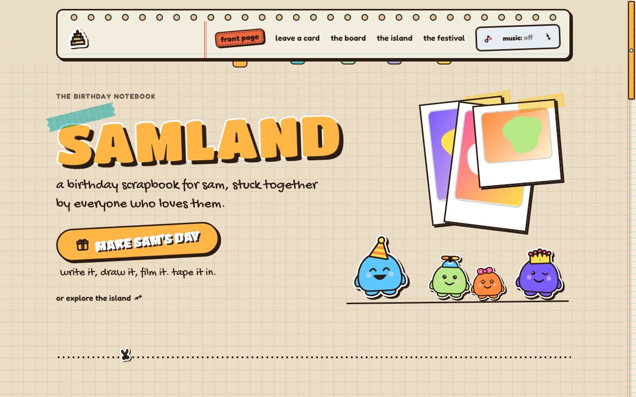
Amber Notebook
milestonegraph paper, masking tape, a binder strip of punched holes and one amber accent on everything you can press.
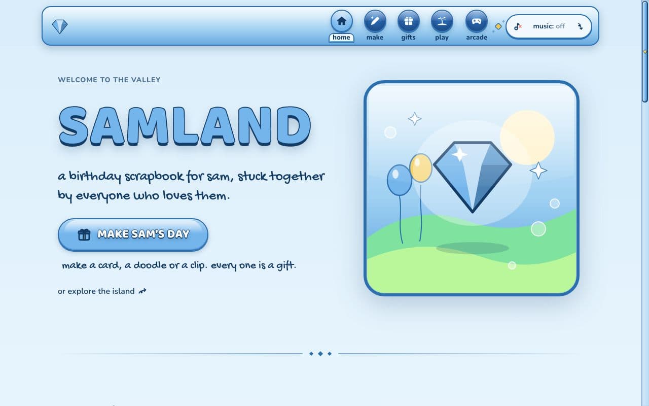
Glossy Valley
milestonesky-blue glass, glossy round buttons and a gem on top: a birthday that plays like a shiny old game menu.
keep reading
themes
the three looks a birthday site can wear: sticker saga free, amber notebook and glossy valley with milestone.
how it works
the whole flow: you set it up, friends add cards from one link, the birthday person explores an island of them.
like it? start a site in sticker saga. friends never pay, and never need an account.